2020 Ends in a Photo Finish with 2016
A Hotter World
As we predicted a month ago, 2020 closed out the year in a statistical tie with 2016 for the title of warmest year on record. The global average surface air temperature for the year is estimated to be 1.27ºC (2.29ºF) above the average temperature in the pre-industrial reference period (1850 – 1900.) The last six years are the six warmest years in the historical record, as shown in the graph below.
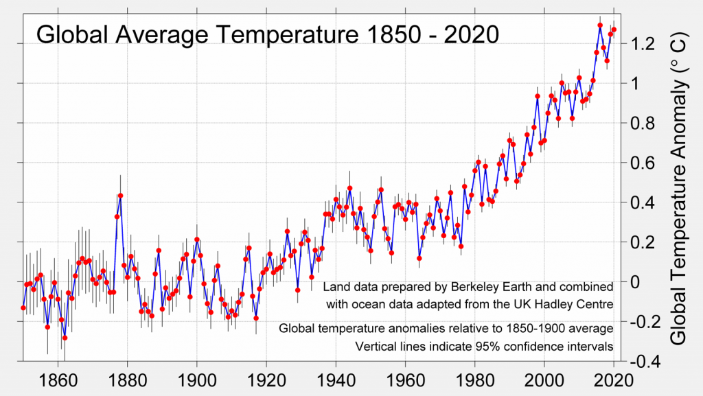
Global average temperature 1850-2020 Source: Berkeley Earth
The results for 2020 are all the more remarkable considering that the 2016 annual average temperature was boosted by an the global impact of an exceptionally strong El Niño warming event, while 2020 experienced the cooling effect of a La Niña event late in the year.
While the earth as a whole warmed by about 1.3ºC over the pre-industrial benchmark, land areas have warmed far more – by an average of 1.96ºC. (Oceans warm more slowly than land areas. More details here.) Considering only land areas, 2020 is far and away the hottest year on record. Berkeley Earth estimates that 45 countries around the world set annual average temperature records.
Regional Records
The typically uneven distribution of warming trends around the world is illustrated below, with Europe, Asia and South America setting records in 2020. Note that there were no locations on earth that challenged cold temperature records.
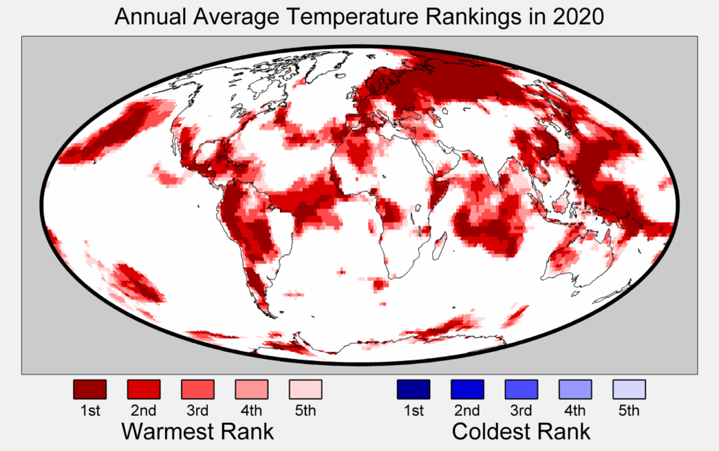
Continuing the trend of recent years, warming in the Arctic was significantly stronger than the global average. As warming melts sea ice earlier over broader areas, and decreases snow cover, more sunlight is absorbed by the darker surfaces, which in turn causes more warming, a process called Arctic Amplification.
Nowhere was the effect of Arctic Amplification more evident in 2020 than in Russia. The average temperature in Russia was almost 4ºC (7ºF) above pre-industrial levels – setting a new record, a full 1.2ºC above the previous mark. The largest extremes were in Siberia, where the annual average was nearly 5ºC above the pre-industrial benchmark, with the warmest locations in the region over 7ºC warmer than average.
Arctic warming was manifest in thawing permafrost and record wildfires in Siberia, and a record three and a half month stretch of navigable open water in the Northeast Passage from the North Atlantic to the Pacific along the Siberian coast.
A Disastrous Year for the U.S.
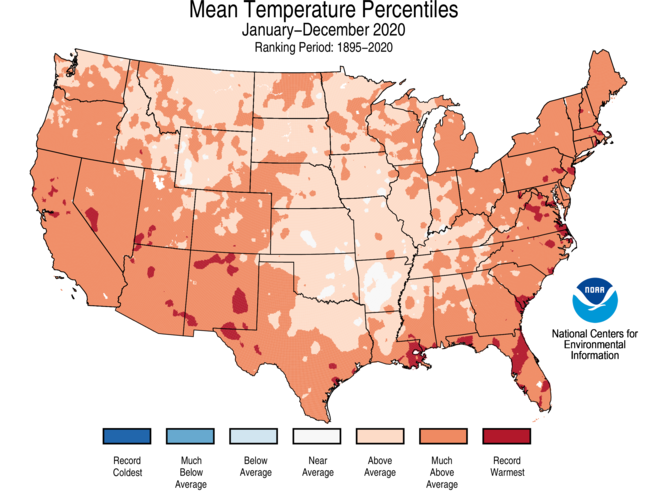
In the U.S., the 2020 annual average temperature for the lower 48 states was 2.4ºF above the 20th century average – the fifth warmest in the 126-year period of record. The map below shows that the majority of the continental U.S. experienced annual average temperatures much above average, with a number of locations setting records. NOAA reports that the five warmest years on record have all occurred since 2012.
Unfortunately, the warming climate contributed to an unprecedented number of natural disasters in the U.S.
As we’ve covered previously, the hurricane season featured a record 33 named storms, twelve of which made landfall in the U.S., beating the previous record of nine landfalls set in 1916. In Florida, we experienced one of the hottest summers on record, with many locations reporting 2020 as their hottest year on record.
The western U.S. suffered through a record wildfire year in 2020, including five of the six largest fires in California history and the three largest fires ever recorded in Colorado.
All told, the U.S. logged no fewer than 22 separate billion-dollar disasters in 2020, smashing the previous record of 16 set in 2011 and 2017.
Looking to the Future
The link between our warming climate and greenhouse gas emissions is indisputable. The E.U. Copernicus Climate Change Service reports that global carbon dioxide concetrations in the atmosphere set a new record in 2020, reaching 413.1 ppm.
The goal of the Paris Agreement is to limit the increase in global average temperature to less than 2ºC above pre-industrial levels, with a best-case target of 1.5ºC above the pre-industrial average. Those temperature targets are only achievable if CO2 levels are no higher than 450 ppm or 430 ppm, respectively
At 1.27ºC of warming and 413.1 ppm CO2, 2020 is already perilously close to the 1.5ºC target. In fact, the WMO reports that there is at least a one in five chance that the average global temperature will temporarily exceed 1.5°C by 2024.
The tsunami of climate data, simulation model results, disaster reports, future forecasts, and competing policy proposals can be overwhelming. So we will close with this elegantly simple graphic from Ed Hawkins of Reading University. It comprises maps of global average temperature anomaly data from 1850 to 2020 in a single image. Each map colors areas below the reference period average in shades of blue, and areas above in shades of red.
We can all see the world getting hotter.
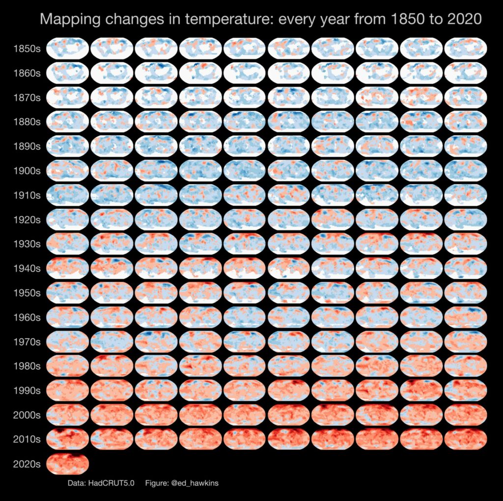
Graphic by Ed Hawkins, University of Reading (@ed_hawkins)