Looking at the Climate Future after COP26
Where Are We Now?
As we hoped, good news came out of the 2021 U.N. Climate Change Conference (COP26) in Glasgow, Scotland. At the same time, the drumbeat of bad news related to climate warming (think extreme weather, drought, natural disasters) continues to rumble in the background.
Before we take a look at today’s Good News and the Bad News, let’s recap where we are. There is no longer any doubt that humanity’s talent for liberating carbon dioxide and other greenhouse gases from fossil fuels is warming the planet. The figure below from the #showyourstripes project of Ed Hawkins, University of Reading, shows the trend in global temperature over the last 171 years, relative to the average temperature for 1971 – 2000 (the zero line on the chart.) The years that are much hotter than the 1971-2000 benchmark are marked in deep red, while the coldest years relative to the benchmark are deep blue.
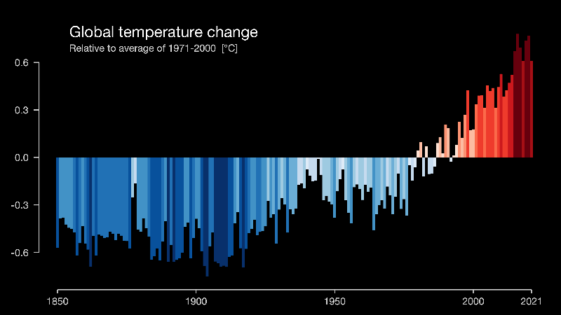
#showyourstripes chart by Ed Hawkins, University of Reading. License: CC-BY4.0
Even though the 1971-2000 average temperature is higher than at any point in the preceding 120 years, it pales next to the two decades that follow. Over the last seven years annual global average temperatures have ranged from 1.2ºC to 1.36ºC above the 1850-1900 “pre-industrial” benchmark. Natural climate variability is superimposed on top of the long-term global warming trend. For example, under a persistent La Niña cooling event the 2021 global average cooled slightly to 1.21ºC—making it “only” the sixth warmest year on record.
Although 2021 was not a global record year, Berkeley Earth analysts estimate that about 1.8 billion people experienced a record warm year where they live. Twenty-five countries set record high annual average temperatures.
All right. It’s getting warmer, but aren’t governments around the world working on the problem? That’s true. For nearly three decades the U.N. has been bringing together almost every country on earth for global climate summits, most recently the COP26 conference in November, 2021. Over time, these conferences have pushed governments and corporations to come to terms with global climate warming and its consequences.
Which brings us to 2022 and our good news/bad news discussion. Let’s save the good news for last, so we can end on a high note!
The Bad News
The following chart is a brilliant mash-up put together by the team at Norwegian publication Bergensia, self-described as “The Sustainability Gazette.” The core of the graphic is the rising line tracking the rising concentration of CO2 in the atmosphere — the iconic “Keeling Curve.” Since Charles David Keeling began daily measurements at the Mauna Loa, Hawaii observatory in 1956, the Keeling Curve has tracked the inexorable growth of atmospheric CO2. The inclusion of Ed Hawkins “stripes” brings home the link between climate warming and anthropogenic CO2. Finally, the Bergensia chart shows the dates for key U.N. climate conferences and events. No wonder Bergensia assigned the chart the hashtag #climateINACTIONstripes — it seems the more we discuss the climate warming problem, the warmer it gets!
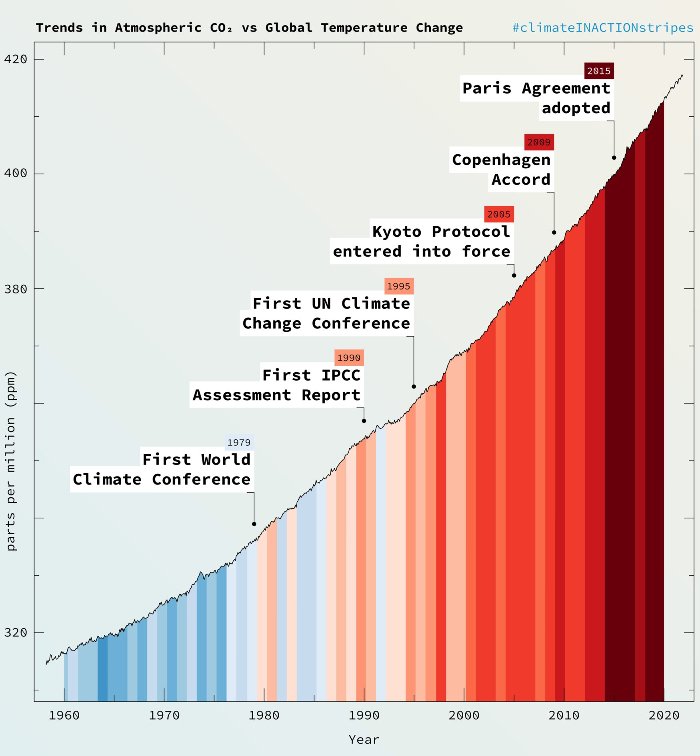
A composite graph courtesy of Bergensia – The Sustainable Gazette: showing atmospheric CO2 concentration up to December, 2021 (credit: Scripps Institution of Oceanography, NOAA Global Monitoring Laboratory), and #ShowYourStripes average annual temperatures (credit: Ed Hawkins, University of Reading, and UK Met Office) CC-BY 4.0
And the beat goes on — the Scripps Institution of Oceanography (which maintains the Keeling Curve) reported CO2 concentration of 420.01 ppm on March 31,2022.
The 2015 Paris Agreement commited countries to limit global average temperatures by 2100 to “well below” 2ºC above the pre-industrial (1850-1900) average. At the same time, the countries agreed to shoot for a temperature rise of 1.5ºC to minimize the impacts of future climate warming as much as possible. Meeting that goal would mean achieving net zero GHG emissions by 2050. The 2018 Intergovermental Panel on Climate Change (IPCC) Special Report on 1.5ºC confirmed that temperatures higher than 1.5ºC would risk far worse climate impacts than the extreme weather events we are experiencing today. It also confirmed that international commitments at that time were insufficient to meet even the 2ºC goal. In fact, a U.N. Emissions Gap Report issued on the eve of the Glasgow COP26 conference predicted we were on track to reach 2.7ºC in 2100. That was the situation just a few months ago.
Fortunately, we have some good news.
The Good News
The first piece of good news is that the combined commitments, net zero pledges and targets announced at COP26 offer, for the first time, the opportunity to keep climate warming to less than 2ºC by 2100 (1.8ºC in the Optimistic Scenario in the chart below.) Opportunity is the operative word — substantive action is required.
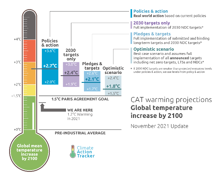
The four scenarios in the Climate Action Tracker chart represent levels of certainty. “Policies and Action” represents the range of outcomes based on policies that are currently enacted into law, Canada’s carbon tax for example. At the other end of the spectrum, the “Optimistic Scenario” includes everything as of COP26, from current law to net zero targets whose mechanisms are neither specified nor implemented. Note that the Climate Action Tracker projections are the median estimate for 2100. Thus there is a 50% chance that the Optimistic Scenario temperature could be higher or lower than 1.8ºC.
The International Energy Agency (IEA) analysis of the national and corporate targets as of COP26 concluded that “if they are met in full and on time, they would be enough to hold the rise in global temperatures to 1.8ºC by the end of the century.” That’s a big “if.” Still, we are definitely moving in the right direction.
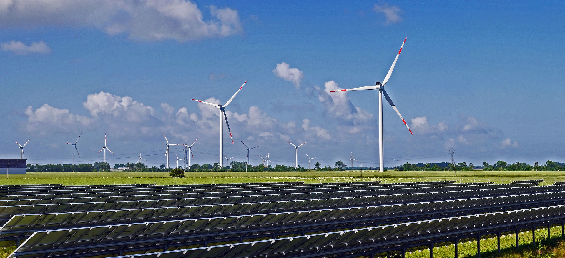
The next bit of good news comes from Ember, a climate-oriented energy think tank, in the form of their Global Electricity Review 2022. As we’ve discussed in previous articles (U.S. Climate Strategy and Roadmap to Global Net Zero, for example), electric power generation is the long pole in the tent for lowering GHG emissions.
Good news highlights from the Ember report include:
- clean electricity sources (e.g. wind, solar, hydro, nuclear) provided 38% of global electric power in 2021 (coal accounted for 36%)
- 10% of global electricity generation came from wind and solar in 2021
- 50 countries get more than 10% of their power from wind and solar. (Three countries get over 40%)
- solar generation increased by 23% in 2021, wind by 14%
In the same vein, the IEA reported that renewable energy accounted for nearly 95% of new global power capacity in 2021, a trend expected to continue through 2026. However, fossil fuel still powered 62% of electricity generation in 2021. Replacing the installed base of coal, oil and gas generation to meet net zero goals will require very rapid expansion of the clean power industry.
Leaders are only just waking up to the challenge of how quickly they need to move to 100% clean electricity – Dave Jones, Global Lead, Ember
I promised to end this article on a high note, so here it is. Considering 2021’s bad news and good news, for the first time it looks like we have plans in place that could keep warming below 2ºC by 2100, and it looks like we have most of the tools we need to do it.
All we need to do now is make it happen.